Money is a mobile and desktop app for private finance management.
Introduction
We designed a mobile and a desktop application to help you manage your private finances. Our focus was on making it easy to record when you spent money and beautiful and intuitive to gain insight from this data.
Goals
While there are many solutions for financial management we saw a gap: most apps either consider cash tracking or electronic banking. We wanted to do both and focus an a large demographic, not just digital natives who are ready to ditch analog banking all together.
Challenges
Many people have tried tracking their spending – most give up after a few weeks. We wanted for this to become a habit. Taking the pain out of this process meant focusing on how to use the available data best to make this process fast and seamless. It was also important to help people make use of the collected data – you shouldn’t need to become a financial analyst to find patterns in you spending behavior.
What I learned
Looking at the project now (two years later) I think we went overboard with the visual style. We wanted to convey a sense of trustworthiness and probably the right way to go would have been to build much more on native components.
Introducing: Money
Users can add various bank accounts and a savings account to Money. It is also focused on making adding cash transactions manually as easy as possible. We wanted the users the gain a lot of information from the collected data and make exploring it both informative and pleasurable. Thus the user can browse several infographics and even more of them are integrated into the interface.
We thought it was vital that there is a mobile and a desktop application. Each one is focused on specific tasks but designed with each other in mind.
We chose a bold, classical visual style to convey a sense of trustworthiness. To make the app not feel dull and boring we complimented this with small, delightful details like animated icons, pieces of adive and nice notifications. We kept it subtle though in order for it not to become childish or too non-serious.
Mobile App
Add an expense
All fields are filled with smart defaults and suggestions – usually the user can just swipe though!
Budgets
Budgets are available for a quick glance before making decisions.
Transactions
The last week of transactions is available for reflection.
Unlock with TouchID
The app can quickly be unlocked with TouchID.
Unlock with a code
A passcode can also be used.
The mobile application is stripped-down and condensed. It focuses on a quick overview of your current money, your budgets and the latest transactions. The main feature is the seamless process of adding an expense. It relies heavily on smart suggestions based on the users previous transactions. We tried to make this process as fast and unintrusive as possible, so that adding you cash spendings isn’t something you dread.
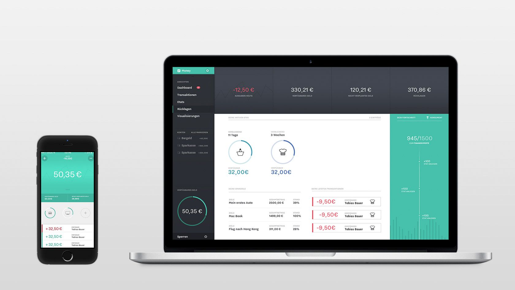
Desktop App
Easy to understand, interactive visualizations help gaining insight about large scale correlations.
All past transactions are show by date and can be searched with simple or complex search terms.
A graph helps keeping track of repeating, past, current and future budgets.
The savings section is for defining goals to save for and track the progress made.
The app supports multiple users. Each account is secured by a passcode.
Our desktop application provides a larger overview. It’s main purpose is to allow deeper analyzation of ones spending behavior.
There is an overview of all past transactions that can be searched using just a simple term like a date or a recipient, but more complex terms and combinations using logical operators are possible too.
In the visualization section there are interactive graphs of the users income or spendings. We picked chart types that offer lots of information at a glance but also allow deep insight if worked with more intensely.
Details
Process & Technology
We created this project using an old school waterfall process with Personas, User Storys, Use Case Flowcharts and so on. We went into wireframing (which included some basic Framer.js explorations) early and I started prototyping the mobile app as soon as the first screen designs were finished. In the ended we created both a desktop and a mobile prototype in HTML, CSS and JavaScript with NodeWebkit and PhoneGap. This allowed us to create real interactive visualizations (with D3.js and Mapbox) and use features like TouchID and GeoLocation.
During the concept phase I wrote a small database application with a basic interface and tracked my real transactions for a month. We used the collected data for our final prototypes.
My Role
My focus in this project was on process design, visual design review and (mostly) protoyping.
Meta
This is a student project created during winter semester 2014 as part of a course in Application Design by Jürgen Graef.